increase in their employee engagement as compared to when the newsletter was offline. We plugged in various interactive sections in the newsletter that let the users engage with it. We embedded small games, made the employee feedback sections socially shareable, and made the entire newsletter dynamic.
increase in employee-led social media engagement during the month of the newsletter release. The newsletter was created to not just document employee progress, but also make them feel like actual superstars. Employees shared the newsletter sections and tagged the brand. It was a PERi-fic share of voice for all.
increase in open rates of the newsletter post it gaining a digital friendly format. We ensured that the newsletter was mobile-optimized. Most employees accessed the newsletter from their smartphones. Coming back to it time and again to engage with its various sections.
more positive feedback from senior executives on the design and digitization of the newsletter. We were the branding and design partners and even executed the newsletter management for the brand. Post digitization, the brand received an increase in positive feedback from their global peers.

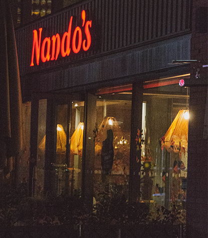
Nando’s is a global food chain with its presence spanning across all seven continents. Each geography has the liberty to choose their digital marketing agency and work with them to fulfil their marketing and branding needs. In India, Nando’s chose The Anatomy as their branding and graphic design company. We were also onboarded as their newsletter management company. Nando’s globally have defined visual language and tonality guidelines that have to be adhered to. A dedicated team from The Anatomy was appointed to work on the account. They trained to study and apply the guidelines so as to remain compliant with all requirements and principles. Post design, the newsletter was sent to our tech team for digitization. A relevant domain was booked for hosting the newsletter and that was integrated with the main Nando’s website.
We identified two critical issues that needed to be addressed so that we could increase employee engagement. Firstly, the newsletter had to be more accessible. Secondly it had to make employees feel rewarded beyond just their workspace in order for them to engage with it. When we proposed the digitisation of the newsletter, the client highlighted another challenge – the newsletter could not be hosted on the main website as it was only for internal stakeholders and not consumer-facing. Taking this into consideration, we booked a relevant domain and hosted the newsletter on that server, instead. On proposing that the newsletter be linked to the India version of the Nando’s website – the client obtained permission from their headquarters. We helped them integrate a link into their India website through which users could be taken to the newsletter as and when required.


The Anatomy collaborated with Nando’s for a complete digital transformation of their newsletter and increase in employee engagement. We offered them a combination of three core services – branding & graphic design, email marketing, and web design. Through the use of visual elements and technology – we created many points of interaction in the newsletter for the employees to engage with. Nando’s has a peer review system where employees get appreciated on the good work, they’d put in. We made the layout in a way where each employee appreciation card could be shared via email and social media. We also introduced small Nando’s themed games that the employees could complete and tag their submissions to win a reward. Since the newsletter was accessible on their smartphone, employees were able to submit their entries in an easier and effortless manner. Happy employees and a happier client was motivation enough for us to keep dishing out good service.


